Visualize World Heat
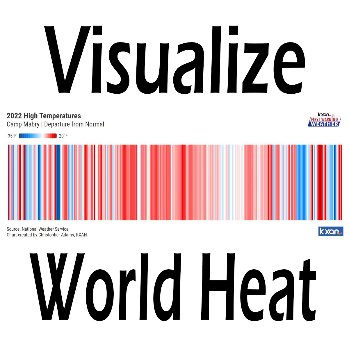
The cover image for this story shows the daily high temperature anomalies for the Austin weather station at Camp Mabry for each day of the year 2022; one colored stripe for every day of the year. The anomaly is the difference in the temperature from normal where red colors are warmer than normal and blue are cooler than normal. The darker red colors are hotter than the lighter, and the darker blues are colder. The left end of the image is the beginning of the year, the right end is the end. This is an interesting way to look at high temperatures over a long period of time.
The middle of the image dominated by red is not red because it is summer, it is red because the high temperature each day is warmer than normal. The left and right ends of the image appear to have about an equal mix of red and blue lines. this indicates normal weather, where high temperatures are equally divided among days that are warmer than normal and days that are cooler than normal.
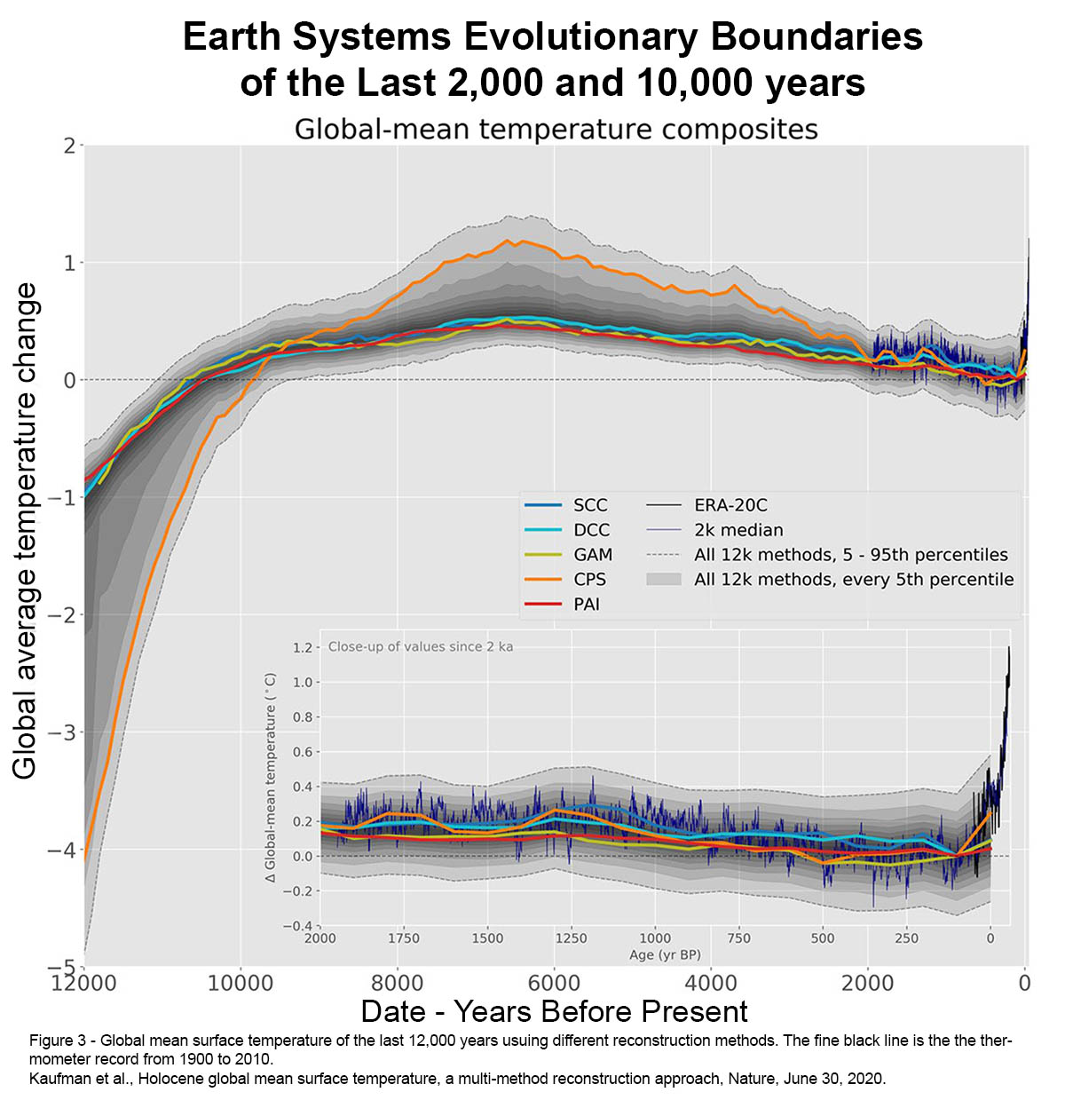
One challenge with “normal” weather that is absent from popular climate culture however, is that the “average” temperature for any given place, is changed by the National Weather Service (NWS) every ten years. The reason the NWS changes the averages every ten years is because of the slight changes in the natural variation of our old climate. These “normals” have been issued by the NWS, formerly the National Weather Bureau, since 1890. The slight variations in our old climate should not be confused with human-caused climate change. These changes were on the order of a tenth or two degrees C, and they lasted for a decade or two or three then the temperature changed back in the other direction, always oscillating within about a half degree C either side of the average for the last 2,000 years, and one degree C either side of the average for the last 10,000 years.

The average temperature globally for the last 2,000 years has been no more than a half degree C and for the 10,000 years before that, 1 degree C.
Image: Kaufman 2022, doi:10.1038/s41597-020-0530-7.
Because of stability of our climate for the last 2,000 years, our ecologies are very sensitive to temperature changes greater than a half degree C above normal. This is where we find ourselves today with the global average temperature in 2023 at 1.5 degrees C above normal. Our ecologies or Earth systems, are beginning to collapse so that new species can evolve a new system tolerant of the new conditions. Once a system begins to collapse, it cannot stabilize unless the thing that caused the collapse to begin is removed. When a systems begins to collapse, it usually also flips from storing carbon to emitting, that is, creating greenhouse gas emissions instead of sequestering them.
This small amount of temperature change caused by us humans burning fossil fuels may not seem like much; 1.5 degrees C is 2.7 degrees F but, warming over lands is twice the global average because our cool oceans act like planetary air conditioners. This means that the average temperature change over land is 5.4 degrees F. Critically, it is extreme temperatures that are the most meaningful. In other words, averages never killed anyone. It’s the extremes that matter.
In 2023, the Austin area endured 43 days at or above 105 degrees, where the previous record set in 2011 when we endured our new Drought of Record, was 26 days at or above 105.
We had 81 days at 100 or above in Austin in 2023. The average number of days at 100 or above in our old climate in the 20th century was 10.5 days. In 2011 we had 90 days over 100 but 2023, as shown by the 105 degree record in 2023 above, was at least as painful as 2011, even though 2023 had 9 fewer days at 100 or above. This illustrates once again that it’s the extremes that matter, and the way heat works in physics, a little warming doesn’t create a little more extreme weather, It’s a nonlinear relationship so a little warming creates a lot more extremes.
