It appears that we have truly crossed a threshold. Since 2005, every year Arctic sea ice extents have been below every other year in the record back to 1979.
Of course, we can’t tell with absolute statistical certainty. But we have been warned for decades that this would happen. This year’s melt record exceed the previous record by a huge margin. The previous record was set in 2007 and it exceeded the previous record set in just 2005 (see my post on October 1).
The National Snow and Ice Data Center (NSIDC) has just published a dynamic graphic interface to view their Arctic sea ice extents records. Sea ice growth in the Arctic was faster than normal for November, but Hudson Bay and Baffin bay in eastern Canada and between Canada and Greenland were below normal. The bearing sea between Alaska and Russia was again above normal Last year the Bearing Sea broke it’s all-time high sea ice extents record.
The difference between the Arctic on average and places like the Baring Sea is an excellent example of one of two things. It’s either natural variation or changes in ocean circulation patterns caused by climate change. We have seen greater sea ice flow out of the Arctic in some of our recent records. This change has been attributed to changes in wind flow linked to climate change. So the water has to be coming from somewhere. There is too much science out there for me to keep up with everything, so the Bearing Sea may or may not be influenced. I do know that the Greenland Straights have seen an increase in med-level waters flowing in the Arctic Basin.
The biggest discussion the Deniers and Delayers are having with themselves about Arctic sea ice involves changing wind patterns and whether or not climate change is responsible. In 2007, when we had the biggest record smashing minimum extents yet, winds were favorable to bunching up the ice and leaving more Arctic ocean ice free. But this year that was not the case.
And btw, we call it extents because melt is misleading. Wind does play a role. As summer progress, melt allows the sea ice to thin. This allows for it to break up into smaller and smaller pieces. Then the edges of the pieces melt and the pieces get smaller. If there were no wind, the sea ice would be somewhat evenly distributed across the Arctic. So we measure the extents, or the area actually covered by ice.
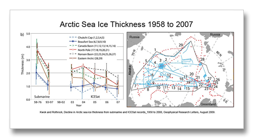
Another way that we know that sea ice in the Arctic is actually decreasing with warming is that we are now able to understand the volume of ice in the Arctic. Starting with Cold war records from submarines and their strategic investigation of Arctic Sea ice thickness we have a really good understanding of how things have changed since 1958. Submarines can only break through some four feet of sea ice, or at least back then, so the Navy had a really good idea of how thick the ice was in a lot of places across the Arctic.
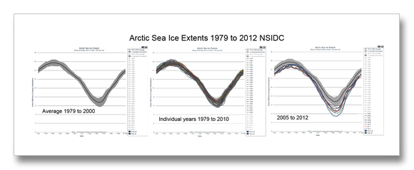
The statistics always become more robust with more data, but we do not have time to waste. We have been warned. The graphs below show a fairly stable set of data between 1979 and 2005 and then after 2005 the bottom falls out. We have been warned of thresholds in our climate system.
The graph on the left shows a gray area that is the average of all years 1979 to 2000, the black line in this graph is the average of all those years. The middle graphs shows how each of the individual years fits within this gray area. There are a few years that come out, notable 2011 to 2005 in a few places, and there is also an area of gray at the very maximum of melt that is not covered by any particular year. I think this is an artifact of the averaging process.
The real shocker comes when we look at 2005 through 2007. These seven years are graphed on the right with the average of 1979 to 2000 still visible in gray. there are a few instances where one of these years falls within the average of 1979 to 200, but nota many. The striking difference in sea ice coverage that began shortly after the turn of the century is what I am referring to as a “Threshold.” Something happened to change the data significantly about the turn of the century. What was it? was it natural variation or something climate scientists have been warning us about for decades?
And another aside: Please don’t call it a death spiral. We are having a hard enough time as it is. The solutions will be much, much easier than the D& D crowd would have us believe. We have not passed a point of no return. If you have fatalistic friends and colleagues, please deliver this message. David Letterman comes to mind. His behavior, while nothing unusual for a crotchety old dude, is simply out of place in this issue. (His attitude is that we have lost the battle, generally.) The words “Death Spiral” is very harsh and it sends a very harsh message. We don’t need Letterman broadcasting to his 3.2 million person network audience that the situation is hopeless. It is anything but hopeless.


