The U.S. Senate Committee on Environment and Public Works heard climate testimony as to whether or not climate change was real. Conservatives on the committee continued to use their tried and true talking points from the smoking, acid rain, and ozone depleting chemical controversies: that the science is not clear, the cause is not certain, it is politically motivated, and that regulation would harm our economy. They said that the President and the EPA were denying the truth, that extreme weather, hurricanes, tornadoes and floods were not increasing in intensity or frequency.
Nothing new here. I would like to clear up a few things that Dr. Judith Curry said that appear to have different explanations than given by the testimony:
She said the 2013 IPCC “weakens the case for human factors dominating climate change in the 20th and early 21st centuries,” because:
1. Lack of warming since 1998 and the growing discrepancies between observations and climate
model projections
2. Evidence of decreased climate sensitivity to increases in atmospheric CO2 concentrations
3. Evidence that sea level rise during 1920-1950 is of the same magnitude as in 1993-2012
4. Increasing Antarctic sea ice extent
Lack of warming since 1998… This is of course the “Temperature Flattening Myth” and what the IPCC has to say about it in the is 2013 report is a decisive warning to radical skeptics to use statistics wisely (no cherry picking). From the second page of the Summary for Policy Makers: “Due to natural variability, trends based on short records are very sensitive to the beginning and end dates and do not in general reflect long-term climate trends. As one example, the rate of warming over the past 15 years (1998–2012; is 0.05 [–0.05 to +0.15] °C per decade), which begins with a strong El Niño, is smaller than the rate calculated since 1951 (1951–2012; 0.12 [0.08 to 0.14] °C per decade).”
The climate science machine is replete with very knowledgeable scientists that for some reason have trouble with statistics. The IPCC is full of them too. They have included a large amount of information in their report to try and explain the so called “hiatus” in warming that is superfluous. The warming “hiatus” began with the unprecedented El Nino spike in temperature was 0.15 C in one year. This was equal to all warming in the previous ten years. Using this particular year as the beginning point of a trend is radically wrong and would get any individual a “F” an their Statistics 101 homework in college. And to show this, when the trend starts just the year before in 1997, the trend of the last 16 years of temperature rise is almost identical to the previous 25 years of temperature rise.
What’s more, recent work published after the 2013 IPCC report shows that missing temperature data in the Arctic has biased the global temperature record beginning about the turn of the century (see here). Because the Arctic is warming more rapidly tan any other area of the globe, not including this data would cause the record to be biased in a cool direction. When the data are added back in, recent warming is even greater than before.
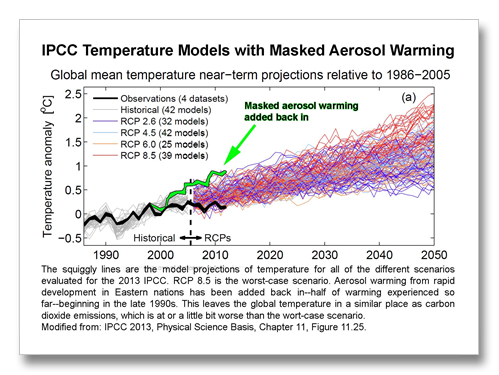
The important part: what the IPCC is not saying when they tell us that there was a hiatus in the warming is that this so called hiatus masks warming that should have happened. The Pacific Decadal oscillation shifting to the cool phase over the last decade masked warming. The Solar Sunspot Cycle being the lowest it’s been in a hundred years masked warming. Recently discovered extra heat going into the deep oceans masked warming.
One more mask, the biggest yet. The IPCC tells us that aerosols are masking 57% of warming that should have occurred due to greenhouse gases already emitted. These aerosols are from air pollution in developing eastern nations mostly that have poor to no air pollution laws. Aerosols are “global cooling” pollutants. When the 57% masking is added back in to the temperature record, beginning about when developing eastern nations really started to boom, the global temperature should be right in step with greenhouse gas emissions: at or above the levels of the worst-case scenario.
Decrease of climate sensitivity numbers… But isn’t climate sensitivity simply a multiplier that tells us how much warming to expect from a doubling of CO2? If sensitivity decreases does that mean droughts are less severe? But seriously, the rate in 2013 is the same as it was in three of the previous four reports: 1990, 1995 and 2001. Only the 2007 report increased a half degree C on the lower end. Climate sensitivity tells us nothing about what the impacts are from warming. This is what is key. The big deal with climate sensitivity is that it’s basically just a thermometer. If impacts are increasing (and they are) with less temperature increase than previously predicted (and they are) the metric by which a doubling of CO2 increases temperature is relatively meaningless.
Sea level rise… What Curry did not say was that those IPCC numbers included what is likely the biggest sea level rise anomaly ever recorded. When the worst drought ever recorded in Australia ended in 2010/11 it happened with the biggest floods Australia has ever experienced. It rained so much in the Outback and it is so flat there that the continent captured and retained 7 mm of sea level rise for 18 months. Sea level actually fell across the planet in 2010/11 instead of rising. The numbers that Curry uses to exemplify her statement that the IPCC weakens their position based on sea level rise once again uses an extraordinary all-time record as an end point. I do not know if Curry knows this or not. The realization of this sea level freak-out was published much after the IPCC stopped taking papers for the 2013 report. (See here for more on Australia’s sea level freak-out link.)
Antarctic sea ice… Curry says Antarctic sea ice increasing is not simulated by models. This is invalid. Increasing winds in Antarctica, caused by a lowering stratosphere instigated by ozone depletion, spreads out sea ice. It is very simple. It’s been in the models since before it happened. There are numerous explanations, some more valid than others. More melt is increasing the freshwater content of the surface waters of Antarctica allowing those increased winds to freeze the water at a higher temperature creating more sea ice. The increased sea ice cover then decreases surface mixing from the wind. Less turbulence keeps the surface sea water, rich with melt, less salty than deeper waters, allowing it freeze faster than saltier water.
What these few radically skeptic scientists completely miss when they try and tell us that the remaining 97 percent of climate scientists do not know what they are talking about, what they really should be standing up and shouting about when they say that climate scientists don’t know what they are talking about is Antarctica losing ice mass. Climate scientists are literally as smart as a box of rocks when it comes to “when” Antarctica is supposed to start losing ice.
Antarctica was not supposed to begin losing ice, according to the 2007 IPCC report, until 2100 or later. According to the 2013 report, Antarctic ice loss has now almost caught up with that of Greenland.
Of course, I say this with an explanation somewhere in the back of my feeble little brain. It helps to explain what Judith Curry and the arguing skeptics are always shouting about. One cannot take what the consensus opinion says for the gospel. Antarctica has been losing ice since the end of the 20th century. Findings from 2003 show us this and these findings and others like the were included as a part of the 2007 IPCC report.
But simple inclusion in such a huge consensus body like the IPCC does not guarantee anything. It takes time for the “Consensus” to soak up the new knowledge into whatever brainbone that it gets slowly soaked into.
This is the single biggest reason for the existence of ClimateDiscovery.com. You the reader deserve to know these things. How are to know this before a decade has elapsed if you have to rely on the media and the IPCC?


