First published on Truthout, February 11, 2015.
The last time we had this discussion was 2013, remember? Before that it was 2010. Before that it was 2005 and everything started with the Super El Nino in 1998. Statistically, saying that 2014 was the hottest year ever is a very valid thing and if you understand statistics I am envious of you.
But the global average temperature for these years, and every year since 1998 except 1999 and 2000, have all been virtually tied if one is a causal civilian statistician watching or reading reporting on television or the media. But a few things have been overlooked in this and the periodic media/blog outbursts that have preceded this event.
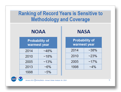
Across the mediasphere it is being said once again that because the probability of this year being the hottest year ever was only 48, or 38 percent (or less), or because the United Kingdom’s Meteorological Service (UKMet) said that 2014 was not the hottest year, this all somehow casts the validity of climate science into question. Can the science be trusted? Is it all because of natural cycles? Are the scientists corrupt? Do statistical probabilities associated with this supposed hottest year ever temperature record mean that this data is wrong?
To understand probabilities from a non-statistician’s point of view, think of a 100-year storm. Every year there is a one percent chance or a one percent probability that a 100-year storm will happen where you are. Relating the temperature record from this concept then would mean that this year’s temperature record would definitively be the hottest ever for 38 or 48 years out of a hundred. But is this exact probability even important?
The answer is of course, yes and no. Yes it is important. 2014 was the hottest years ever when considering the NOAA and NASA data sets. And at the same time no, the real answer lies in the big picture.
Here’s the rest of the story:
The Probability Thing: the simple sit down and shut up answer is that the probability that 2104 was the hottest year ever for NASA and NOAA are higher this year than for the previous records for 2010, 2005 and 1998. Not only do NOAA and NASA say they are more confident about this statement, they are a lot more confident. (See the graphic “Ranking of Record Years…”)
NOAA’s and NASA’s 2014 hottest year ever results are two and a half to ten times more likely to be valid than the previous records.
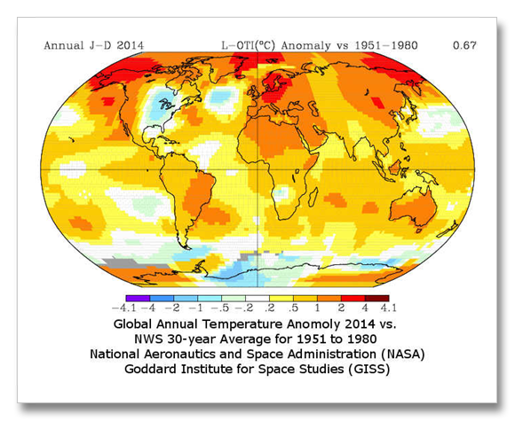
The UKMet: This temperature data set (HADCrut) disregards large areas of the globe like the Arctic. The reason is that there are no weather stations in these places. NOAA and NASA however, take the weather stations closet to the Arctic and use some of the high powered statistics briefly alluded to earlier and extrapolate that data into the Arctic Ocean. the UKMet simply disregards that area of the earth as if it did not exist.
The “extrapolation” of nearby weather station data into areas without stations is really a computer modeling exercise. We know these exercises are accurate because when temperature data for large areas of the globe–where we do have weather stations–are removed and then recreated with this technique, they are reproduced very well. This means that UK Met is missing a large area of the globe that is warming faster than anywhere else. By not including this rapidly warming area in their data, it skews their results towards the cool side.
Does any of this matter? Does any of this mean that climate change is not real, or the Greenland Ice Sheet is not melting six times faster since 2002, or sea level not rising three times faster than the twentieth century average? (1, 2)
The 2013 IPCC report now says that; “The best estimate of the human-induced contribution to warming is similar to the observed warming over this period [1951 to 2010].”(3) This means exactly what it sounds like—that mankind is responsible for all warming since at least 1951. This is not what the IPCC says in the immediately preceding sentence however. That sentence says: “It is extremely likely that more than half of the observed increase in global average surface temperature from 1951 to 2010 was caused by the anthropogenic increase in greenhouse gas concentrations and other anthropogenic forcings together.” Why the discrepancy and what is the meaning of, “human-induced contribution to warming is similar to the observed warming.”
This “human-induced contribution to warming is similar to the observed warming” is an expert judgment. The models and evidence don’t say this. The models have challenges and we simply don’t know all of the evidence that there is to know, or even all of the important bits. Definitively, what we do know is that greenhouse gases have caused very likely 60 or 70 percent, or likely (without the further qualifying adjective “very”) 80 something percent of warming, depending on which model or data set is used.
The IPCC statement that; “It is extremely likely that more than half of the observed increase in global average surface temperature from 1951 to 2010 was caused by the anthropogenic increase in greenhouse gas concentrations,” is a definitive statistical statement that comes with probabilities and confidence intervals and all sorts of other statistically meaningful (to those lucky few) information. “Extremely likely” means 95 to 100 percent certain, “very likely” means 90 to 100 percent certain, “likely” means 66 to 100 percent certain.
Enough statistics. Now this all has to be tempered with an understanding of the difference between absolutes and expert judgment. Results of data evaluation, like computer models, come with absolute attribution (sorry, more statistics). We know exactly what chance any result have of being correct (like the 100-year storm occurrence.) Expert judgment does not come with absolute answers. It’s judgment.
This can be a little more easily understood through one of my favorite quotes about models: “all models are wrong, but most are useful.” Saying all model results are wrong is not at all an accurate thing to say, but saying that all model results come with probabilities and confidence limits is valid. Expert judgment finds the results of models “useful” in making other decisions that involved values and risk.
The IPCC’s statement that “The best estimate of the human-induced contribution to warming is similar to the observed warming…” is a piece of expert judgment. It does not reflect the results of the models directly, but when considered with other evidence, the 600+ authors of the 2013 IPCC report feel that their expert opinion is just as important as what the statistics say based on imperfect data and modeling.
This “expert judgment” of the IPCC is just like what an engineer does when she/he designs something. Those designs work almost all of the time. They work because the engineer used her/his professional judgment of what variables to use and how to apply risk. Climate scientists are still trying to figure out the variables with climate models, and goodness knows; our society has huge challenges in assigning risk to climate change. Expert judgment is not only valuable, it is very important in our society. It helps us place value and determine risk where absolutes may not be fully defined. Your doctor uses expert opinion on a regular basis.
So? There’s still a pause in the rise of the global average temperature. Doesn’t that mean that global warming has stopped, or that climate change is only a natural cycle, or it is not real or not caused by man? Carbon dioxide is rising more rapidly than ever in recorded history and literally as fast as at any time since the giant asteroid hit the Yucatan Peninsula and the dinosaurs went extinct, so why did the temperature stop rising?
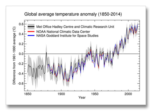
In the first graphic above, “Global Temperature Anomaly 1850 to 2014” there was a big, huge pause between World War II and the end of the 1970s. It was at least largely caused by rapid industrialization after World War II and the resulting air pollution. This air pollution, or a large part of it, was sulfates emitted from power plants and automobiles. These sulfates are global cooling pollutants and they masked warming from increasing carbon dioxide pollution in our atmosphere during post-war western prosperity. (4)
In the early 1970s, Nixon enacted the Clean Air Act and the European’s enacted similar air pollution laws. Warming returned as the air cleared.
California air pollution was almost as bad as Beijing today. Which is the big connection: Air pollution from China (and India), much greater than air pollution from the US and Europe after WWII, is causing the “pause” today, or at least it is causing a big part of it. The 2013 IPCC says that 57 percent of warming that should have already occurred to date has been masked by global cooling sulfate pollution. China and India began to boom about the turn of the century, which is exactly the same time as this most recent “pause” began.
There is yet another reason that the pause has inflicted itself upon decent climate scientists lately and this has already been alluded to. Arctic temperatures, until 2013 in the U.S. and still not in the UK, were only vaguely represented in the global average temperature. NOAA and NASA upgraded their techniques for estimating Arctic temperatures in 2013, but the UK Met still disregards. Not including these temperatures in global evaluation biases the global average so that it is cooler than what is actually occurring on this planet.
So whether or not 2014 was “really” the warmest year ever (it was, but only by a little bit), it “really” doesn’t matter. Pauses happen. We know why they happen and greenhouse gases continue to grow at ever faster and faster rates.
References:
1) Greenland ice loss increased 632 percent… 2013 IPCC, Summary for Policy Makers, E.3 Cryosphere, page 7, second bullet.
http://www.ipcc.ch/pdf/assessment-report/ar5/wg1/WGIAR5_SPM_brochure_en.pdf
2) Sea level rise triple the 20th century average… From the abstract (Harvard and Rutgers) “ Here
we revisit estimates of twentieth-century GMSL [global mean sea level rise] rise using probabilistic
techniques and find a rate of GMSL rise from1901 to 1990 of
1.2(+/-) 0.2 millimeters per year (90% confidence interval). Based on
individual contributions tabulated in the Fifth Assessment Report
of the Intergovernmental Panel on Climate Change, this estimate
closes the twentieth-century sea-level budget. Our analysis, which
combines tide gauge records with physics-based and model-derived
geometries of the various contributing signals, also indicates that
GMSL rose at a rate of 3.0 (+/-) 0.7 millimeters per year between 1993
and 2010, consistent with prior estimates from tide gauge records.
The increase in rate relative to the 1901–90 trend is accordingly
larger than previously thought; this revision may affect some projections
of future sea-level rise.”
Hay, et al., Probabilistic reanalysis of twentieth century sea level rise, Nature, 14093, January 2015.
http://tinyurl.com/pzghfxr
3) Observed Warming similar to climate response… “It is extremely likely that more than half of the observed increase in global average surface temperature from 1951 to 2010 was caused by the anthropogenic increase in greenhouse gas concentrations and other anthropogenic forcings together. The best estimate of the human-induced contribution to warming is similar to the observed warming over this period.” (emphasis added)
IPCC AR5 Summary for Policy Makers, D.3 Detection and Attribution of Climate Change, page 15.
http://www.ipcc.ch/pdf/assessment-report/ar5/wg1/WGIAR5_SPM_brochure_en.pdf
4) Air pollution caused global cooling between 1940 and the 1970s: Wilcox et al., The influence of anthropogenic aerosols on multi-decadel variations of historical climate, Environmental Research Letters, June 5, 2013, abstract: .
http://iopscience.iop.org/1748-9326/8/2/024033/pdf/1748-9326_8_2_024033.pdf


