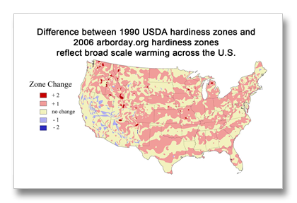
Five degrees of change—a half zone. Not average temperature; this is based on the average last freeze.
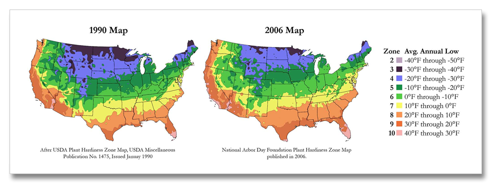
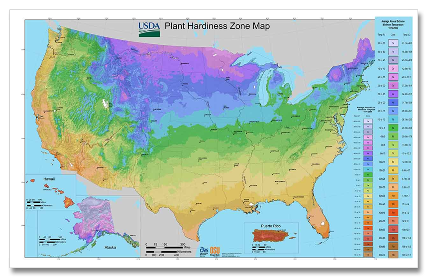
I gave a presentation to the Austin Organic Garden Society last month and I remembered USDA had recently come out with new hardiness zone maps. The USDA changes in 2012 are not so much different than the 2006 National Arbor Day Hardiness Zones updated from 1990. USDA has their map divided into “half-zones” and the colors are different. Because there is not much difference, the best way to see the changes are from looking at the Arbor Day maps. lass=”style3″> From the Arbor Day Press release: “The new map reflects that many areas have become warmer since 1990 when the last USDA hardiness zone map was published. Significant portions of many states have shifted at least one full hardiness zone. Much of Illinois, Indiana, and Ohio, for example, have shifted from Zone 5 to a warmer Zone 6. Some areas around the country have even warmed two full zones.” The maps are based on the average low temperature and each zone represents a ten degree difference for the adjacent zone. The press release continues: “The new 2006 Arborday.org Hardiness Zone Map is consistent with the consensus of climate scientists that global warming is underway.”
It is important to remember that even though the average low temperature has risen, extremes still occur. Climate change makes these extremes more likely, though the low extremes are less likely than warm extremes. This means we can still experience cold temperatures lower than the hardiness zone maps indicate, and because of the increase in extremes it is not out of the question that new record lows can be set–because of climate change. It is the extremes that kill. Extreme low temperatures that cause mortality are what the hardiness zone maps are designed to predict.
The complicating factor is average warmth. Because warmer temperatures have a higher rate of evaporation, if normal rainfall occurs, drying will be greater. So drought conditions develop faster than if temperatures were cooler. Extreme drought kills just like extreme cold but the maps do not consider this form of mortality.
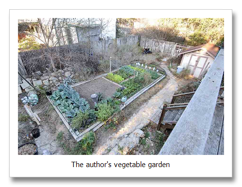
I am a gardener, so you are going to have to put up with a little of my hobby before I g I get to the maps, and I will say that the next few paragraphs are anecdotal. I don’t keep notes about my gardening stuff, I don’t record the weather anymore and my perception of what is going on may not be really what’s going on. But I have been doing this at the same location for 22 years an I have evaluated a lot of local weather records that reveal that my anecdotal stories are more true than not.
My vegetable garden has changed by light years in the last two decades. It’s astonishing how different it is today than when I started gardening here at my home in Oak Hill in 1990. I think a lot of the change has to do with the summertime heat feedback. Since about the turn of the century things have just simply gotten out of hand. Generally it gets way too hot way too soon. It has been six or seven years since I have had a decent tomatoes crop. Tomatoes stop setting fruit when the daytime temperature exceeds about 90 and or the nighttime temperature stays above about 70 degrees. I have been gardening here since 1990 but since about the turn of the century and I have only been able to harvest 15 to 25 tomatoes annually because it gets too hot too early. Last year I think I harvested 6 or 7 (but remember last year was hotter than the drought of the 50s here).
This year is something like old times though. Well not really–we didn’t have a winter this year. It only froze a few times in the hills out west of town where normally it freezes a couple of dozen times. In December 2011, we had a normal amount of hard freezes (several), but as cold as it got was about 24 or 25. In town it just barely froze. But since the first of the year it’s been so, so warm. February was like April. then March was normal and April was like June virtually the entire month with periods like July and August. Our weatherperson actually said “August-like” in April!
In early May it rained for the first time in six weeks and temps fell to normal-it seemed cold. Everyone was saying how cold it was, but the temps were only normal. It only rained about 0.2 inches at my house for six weeks beginning about the first day of spring on March 20. We had more rain in Jan/Feb/March (13.21″) than we did in our 12-month unprecedented drought (September 2010 to August 2011 when we had 11.2 inches of rain). Then it only rained 0.2 for six weeks. In early May it rained five and half inches in three events. Since the turn of the century or thereabouts though, it’s been hot. Even my peppers quit setting fruit last summer. Normally peppers go all the way through. I simply gave up on tomatoes, where normally I can get the vines through until September when they start to set fruit again that ripens in November and December. Several years recently I have had tomatoes on the vine at Christmas. I think it was 2010 that I had them on the vine January 1. Before 2000, it was a challenge to get them through mid December. Now understand that our here in the hills west of town I have to cover up when it frosts or freezes. I can even get the tomatoes through a decent freeze, but once it gets down below about 27 or so, everything turns to mush. It’s amazing what a little blanket, or even a simple cotton bed sheet will do in the garden.
The changes we have seen in our climate are recorded in the changes in the Hardiness Zone Maps. The first map, the one that looks like a pink striped tiger, shows the changes in the minimum annual average temperature across the U.S.
The temperature across the continent, that is the average annual low temperature, has increased a half zone. But the big deal is that the changes have all taken place since the 1990 map was created. All the previous maps are almost identical. The change has been about 5 degrees F. There has been some small cooling out west, but by far the warming has been greater and is much more predominant across the continent. It is also important to understand the way the tiger striping works. The zones are ten degrees each, so the five degrees of temperature change is shown as half of each zone increasing by a full zone and the other half not increasing any. It’s not that the country warmed in these funny strips by five degrees each separated by similarly wide strips where there was no warming. I am sure y’all picked up on that right away–it took me a few minutes.
So that’s the big news – what a change! Of course this is not reflected in the average temperature change across the U.S. because it’s not the average. It’s the average annual low temperature. It’s one of several weather extremes that shape our world. The others are the average hot extreme (which is really the longest average annual hot period, and the driest and wettest periods. These extremes shape our world. It’s not the average temperature that does the damage, it’s the droughts and heat waves and floods and cold snaps. Plants and animals don’t care about averages–they evolved with averages. Human society evolved with the averages. This is why the extremes matter. We did not evolve with extremes that are different
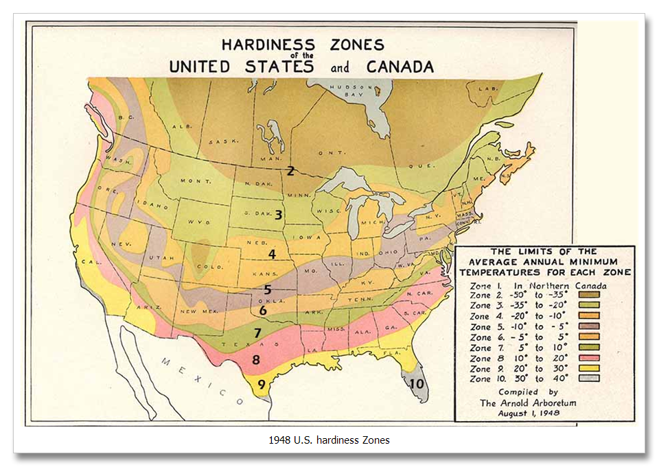
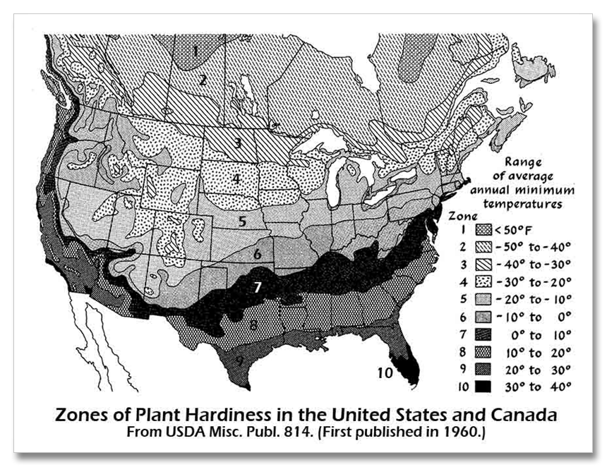
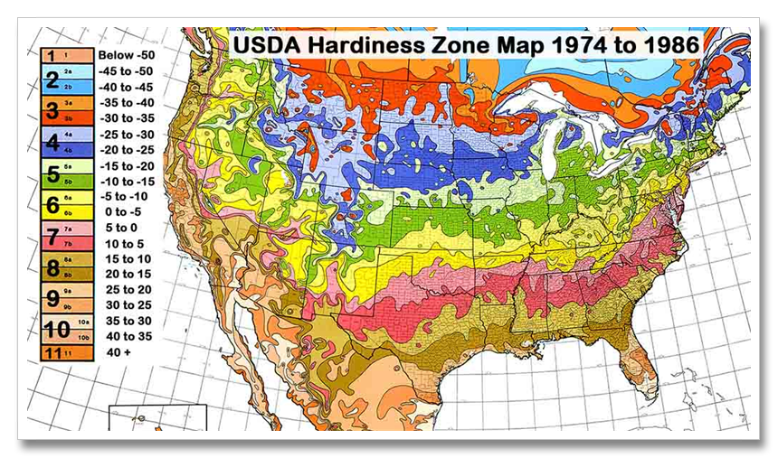
As the heat waves increase in extremeness and frequency, crops will wither, forests will die, lakes will dry. What will we do? And before we get into trouble, what will the animals do when the plants all die like during the great Dust Bowl? lass=”style3″> The first hardiness zone map was created in 1948, then another in 1960 (revised in 1967) and another utilizing more detailed data from 1974 to 1986 (revised in 1990). In 2006 National Arbor Day created their most current map, and in 2012 USDA followed. The differences between the 2006 and 2012 maps are small, it’s the differences that started after 1986 that are substantial. Our climate remained stable during the period from about the turn of the century to 1986 so comparing 1990 to 2006 (above) is the easiest thing to do. Going back into historic time, we know there was a slight warming from about 1800 to 1900 that was less than the average warming we have seen since the 1970s. Before 1800 we know that the temperature fluctuated slightly during what is known as the Little Ice Age (which ended about 1850. Before this is prehistory where we have records from chemical indicators such as oxygen isotopes in ice sheets and caves formations. These tell us that by far, the temperature changes since the 1970s are far more radical than anything in the last 10,000 years.
You can see for yourself. Pick a few places and trace the shifts in zone over time. I have ferretted out the previous hardiness zones maps. Also note a few places cooled between 1990 and 2006, but by far warming is predominant. Also, the first traditional USDA Hardiness Zone Map is not the same scale as those after 1948–zones are 15 degrees, not 10. Click the images to see larger versions.
What does this mean? It’s getting warmer bigtime, and mostly it has happened recently.
Arbor Day Hardiness Zones: http://www.arborday.org/media/zones.cfm
Arbor Day press Release: http://www.arborday.org/media/zonechanges2006.cfm

