Abrupt climate change has arrived. They told us this would happen twenty years ago if we did not reduce emissions. We did not and it has.
The U.S. Global Change Research Program (USGCRP), a Ronald Reagan Presidential Initiative formerly called the U.S. Climate Change Science Program, tells us an important truth in the climate change challenge. Thirteen governmental agencies make up the USGCRP: Department of Commerce, Department of Defense, Department of Energy, Department of the Interior, Department of State, Department of Transportation, Department of Health and Human Services, National Aeronautics and Space Administration, National Science Foundation, Smithsonian Institution, U.S. Agency for International Development, Department of Agriculture, Environmental Protection Agency. What this impressive and authoritative roster tells us in a 2009 report titled Coastal Sensitivity to Sea Level Rise, is that when sea level rise surpasses 7 mm per year (1/4 inch), our barrier islands and coastal wetlands will begin to disintegrate. They will then disappear in time frames that matter. The report does not say how fast, or even when the disintegration will begin, but extrapolation of historic sea level rise rates tells us all we need to know.
Barrier islands (and wetlands) perform an extremely valuable ecosystem service. As the name barrier island implies, these island protect the mainland from the onslaught of storms. Wetlands perform much the same function. What they do is absorb energy. They absorb the high energy of storm surge and storm waves before it can get to improvements on land inland. Once these barriers are gone, anything and everything inland will take much more of a beating than before when storms come around. Even simple peak tides that happen once a month will be significant flooding threats. Normally, the dune line on a barrier island is a vertical wall that hold these high tides back. Water can only flow paste them at the few river outlets along the coast. This means that normal storms and those once-a-month spring tides do not have enough time to put much water through the passes to flood the interior. Without the barrier island though it is a completely different story.
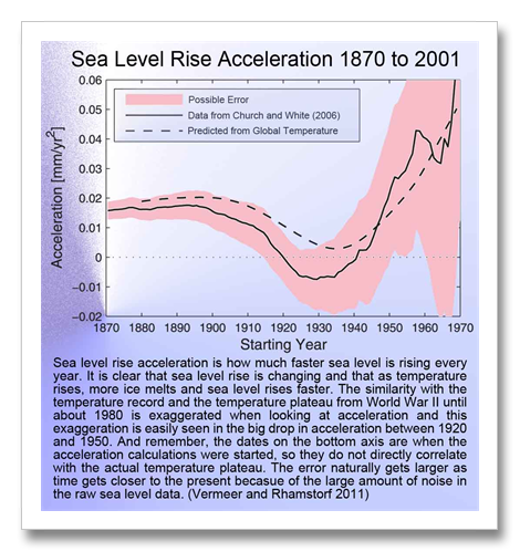
This 7 mm per year sea level rise threshold that the USGCRP warns us about is uncomfortably near and the numbers concerning sea level rise tell the story. In the graphic “Sea Level Rise 1950 to 2008,” for the vast majority of the 20th century, sea level rise was between 1.2 and 1.5 mm per year. The around 1990 it jumped up to 2 mm per year then about 2000 it was 3 mm per year. The numbers for today vary between 2.8 mm per year averaged between 1992 and present, and 3.4 to 3.7 mm per year based on 2004 or 2009 data. The most often reported numbers in the media are between 2.5 and 3 mm per year. These numbers are averages and like the 2.8 mm per year of NOAA cited two sentences ago, do not reflect the most recent sea level rise rates.
The reason that the most often cited numbers is much lower than the most recent years is that there is a lot of variability in sea level rise rate from year to year, normally. Academic work; peer reviewed work and the like must show statistically robust results. We often hear that any one storm can not be blamed on climate change. Same smell with any one year of sea level rise. Until now at least.
We have seen numerous publications in the last three years that show hot temperature records and high and low precipitation records have now become so numerous that the statistics have become valid. Across the world, these record weather events are between 60 and 90 percent likely to have been caused by climate change, or they were made more extreme by climate change depending on what study and where the study looked (like the European, Moscow or Texas heat waves or precipitation extremes in the Southeastern U.S. etc.) In other words, if our climate had of not changed, these weather events would not have been as extreme as they actually were, or maybe even occurred at all.
Sea level rise is a bit different. We only get one data point per year for global sea level rise. It’s like global temperature in this respect. We are still a ways off from both of these particular weather scorecards being proved likely to be caused by climate change because they each contain so few data points. But now we have “logical association.” If heat and precipitation records have been shown to validly have a high likelihood of being caused by climate change, logical association says things highly associated with temperature and precipitation are also highly likely to be in the same boat.
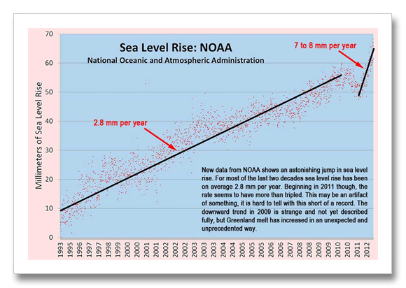
The trend then is a rapid acceleration of sea level rise starting in about 1990 and getting faster and faster the later it gets. At the rate we are going we cross the 7 mm per year threshold before 2020 and our barrier islands begin to disintegrate and disappear. But that was before the National Oceanic and Atmospheric Administration (NOAA) came out with their new numbers.
In the graphic “Sea Level Rise: NOAA,” there is a hiccup and a change in trend rate in 2010 and 2011. First: the 2.8 mm per year average for 1992 to 2010 is NOAA’s number. There are really more like three different trends in this period that range from nearly 2 to nearly 4 mm per year. But it’s not 1992 to 2010 that we need to be worried about.
Something happened in 2010 and 2011. I am not quite sure I buy the explanation given. They say it’s because of La Nina. The reason I am not sure I buy this explanation is that there was a huge El Nino in 1998, much larger in scale than the moderate to strong La Nina we had last year, and the 1998 El Nino is nowhere to be seen in this data. It looks like a change of technology shift that has yet to be corrected, but it may be something completely different, or it may be La Nina. Or it may be the melt from Greenland and the Antarctic–where mass balance continues to be decrease every year by greater and greater margins.
If there is something screwy with this data, we still have the fact that last year’s Greenland melt was much greater than 2011, which was much greater than 2010, which was much greater than 2009 (see August 1, 2012 discussion “Greenland Melts–It’s NOT About the Past.”) Melt in Greenland has steadily increased since about the turn of the century and it is now a force to be reckoned with. (Right click on the image and choose view image to see a large version.)
It was 2007 when I was in Greenland and ice scientists I talked with there surprised me with some anecdotal scientist talk. They said that what they called “The Big Melt” started in 2004. They said that too few years had elapsed since the big melt started to put together robust statistics so there was little they could say about it in their peer reviewed work. Damn.
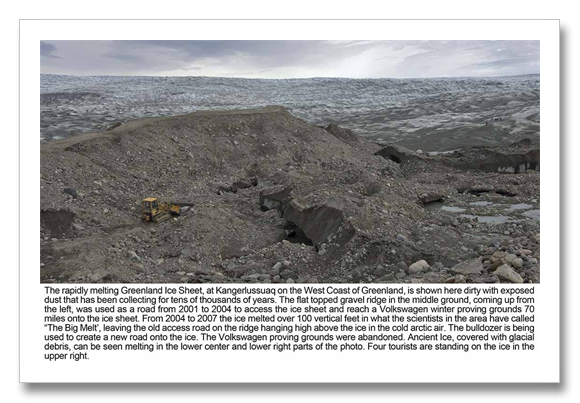
An example of The Big Melt can be seen in what the locals say and in my photography and reporting of other academic research about a place on the edge of the ice sheet called Point 660, near Kangerlussuq on the west coast of Greenland. In 2001, Volkswagen built a winter proving grounds 70 miles up on the ice sheet. They asked the ice scientists if this area, normally frozen 12-months of the year, would begin to melt soon with global warming. The ice scientists said yes and that they should build much, much farther inland. Of course, Volkswagen built their proving grounds 70 miles inland…
They needed a road to transport everything, so they built one that first winter. Something not widely known about the ice sheet is that it is 100 to 200 feet tall at its edge and 11,000 feet tall in the middle, 350 miles away. So for Volkswagen to get their road up on top of the the edge of the ice sheet, they followed what is called an medial moraine. A moraine (a giant pile of rock, gravel and dirt) forms at the end of a glacier or edge of an ice sheet where the ice movement basically bulldozes up the mountains in its path and leaves them in a big pile at the edge of the ice. These moraines can also form between two flowing rivers of ice in the ice sheet. The ice sheet deposits rocks and sand in a long ridge between the rivers of ice. This particular medial moraine was a thousand feet long and was likely formed during the last ice age. Or at least this is what the academic work in this area says. (see Foreman et al below) it also says that the edge of the ice sheet has been in approximately the same place for 150 or more years–since the end of the Little Ice Age.
So what my guide told me in 2007, or more accurately, the driver of the Toyota Land Cruiser ice sheet machine with the big tires that they used to use to take tourist up on the ice sheet, is that 100 vertical feet of ice had melted since 2004. The ice sheet image with the caption that starts “The rapidly melting Greenland Ice Sheet…” shows this melt. The road on the ridge once accessed the ice sheet that was 100 feet taller than it was when this photo was taken in 2007. Right click on the image and choose “view image” for a larger view. then you can tell the difference between the moraine and the ice sheet. The ice sheet is that dirty looking thing that looks like ice covered with dirt. the dirt is dust, collected over tens and tens of millennia and recently melted out of the ice. Also note the little tourists on the ice off to the right.
Now let’s get iup to date. The melt that has happened in Greenland every year since about 2009 has been about the same amount of total melt that occurred between 2001 and 2008. (see again–August 1, 2012 discussion “Greenland Melts–It’s NOT About the Past.”) Things look to have really taken off in the last several years, and even if the new NOAA data is goofy, we are getting much closer to the disintegration threshold of 7 mm per year much faster than before.
Like so many things in climate these days, it seems we are reaching this threshold way ahead of schedule. Schedule? Maybe I just misspoke. There is no estimate of when our barrier islands will begin to disappear, unless you take my estimate as a valid projection. I am simply reporting the ever increasing rate of sea level rise and connecting the dots. Otherwise, this is something climate scientist generally do not approach. It is very much like the way that climate scientists approach dynamical ice sheet disintegration–they don’t. There is simply not enough data to be throwing statistics at to mean anything to a peer review jury.
Sea level rise is one of those sleepers in climate change. There’s lots of noise in the data and lots of littoral specialists (beach guys and girls) that say that sea level is not rising or that it’s subsidence or sand starvation or dune migration that is causing shrinking beaches. And in a lot of cases they are correct. There’s a lot of subsidence and even more sand starvation going on around the world. There are so few wild rivers delivering a natural sediment load to the ocean any longer that most beaches on the planet are sand starved. You see, sand goes away over time. It ends up being carried out to sea and deposited in the deep ocean and constant replenishment is needed from rivers or we get sand starvation. But almost every river on the planet is dammed now and these dams trap sediment unnaturally before it reaches the coast. It is this sediment that feeds our beaches and much of this beach food has been cut off. But sediment starvation nor subsidence nor dune migration explains all beach shrinkage in many places and Padre Island National Seashore (PINS) is one of these places.
PINS is my home beach. I have been there a gazillion times. I own one of those big ice-melting 4-wheel drive Suburbans with the lift kit and giant tires so I can drive the 60 miles of 4-wheel drive only beach. I once fished like there was no tomorrow and the best beach fishing was down PINS. Now I just enjoy. I’ve killed enough bait and poked too many holes in fishes mouths. So now I take pictures and shoot video and simply enjoy the beach, while we still have it. My photographic documentation of the beach goes back to 1984 and the story is plain to see in the one of the posters at the bottom of this discussion.
There is a property of ice called the heat of fusion (enthalpy) that virtually assures that we are going to have a heck of a time putting this genie back in the bottle. It takes 9 times more energy to melt ice at 32 degrees into water at 33 degrees that it does to warm ice from 30 to 31 degrees (or 20 to 21degrees, -1 to 0 degrees, etc.). So once ice starts to melt, just to get back to even–just to get the water frozen again–nine times more energy must be taken out of the melted ice.
We still don’t know what form the barrier island and wetlands disintegration will take, nor how long it will take for the wetlands and barrier islands to disappear. It seems logical that storms and hurricanes will breach the islands in places and these places will not be able to dynamically heal themselves as barrier islands are so good at doing naturally after storms. This is called littoral regeneration or something like that and extra sea level rise of just seven millimeters per year–a quarter of an inch per year, will prevent this natural healing from taking place.
From there the barrier island breaches will widen and more storms will create more breaches more easily as sea level rises more. How long will it take? We can only hope decades or generations. Maybe in this amount of time we can stop the warming and take some of that build up of heat out of the ice sheets to keep them from melting.
I have accumulated a lot of beach positioning, sea level, dune migration and subsidence publications for Padre Island National Seashore. This information, along with my repeat photography is the basis for my outreach campaign to help people understand the ongoing nature of sea level rise and the great risks to our global ecosystem because of the imminent loss of our beaches and coastal wetlands. These references area shown in the following PowerPoint presentation: http://www.meltonengineering.com/Corpus%20101912.pptx One of the reasons that Padre is such a good indicator of sea level rise is the beach there is very stable, or at least it was until “the Big Melt” began.
References:
Barrier island and coastal wetland regeneration threshold of 7 mm per year…US Geological Survey, Environmental Protection Agency, National Oceanic And Atmospheric Administration and Department of Transportation Report, U.S. Climate Change Science Program, Coastal Sensitivity to Sea Level Rise: A Focus on the Mid-Atlantic Region, November 2009. http://www.climatescience.gov/Library/sap/sap4-1/final-report/
Little Ice Age moraines at Kangerlussuaq’s Point 660: Foreman et al., Little Ice Age and neoglacial landforms at the Inland Ice margin, Isunguata Sermia, Kangerlussuaq, west Greenland, Boreas, Volume 36, Issue 4, pages 341–351, November 2007. http://dx.doi.org/10.1080/00173130601173301


