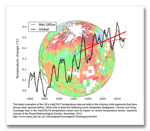
New work out of the University of York in the UK and the University of Ottowa in Canada has pretty much patched another hole in perceived temperature flattening myth. We live and we learn. This story has two parts. One is about the UKs temperature dataset and the other about the main US data set (GISS).
There are six of these datasets from different institutions that all assemble global temperature data from different sources (the United States National Weather Service, the United Kingdom Meteorological Office, etc.). The United Kingdom’s global temperature data set HadCRUT, has historically shown the biggest “flattening” trend of any of them. And as we continue to learn, we (the royal we) have found out why.
HadCRUT ignored the Arctic before now. There are no weather stations up there besides a few in Greenland, so what the other institutions do to make up for not having temperature data across a huge piece of the earth’s surface is to estimate. They take the closest land stations and satellite data (and in the case of non-polar ocean areas, ship and buoy data) and then estimate what the temperature would be; where there are no weather stations, farther and farther away from land and farther north, where the suns energy is decreased because it must travel farther through the atmosphere to strike the Earth and change from light to heat.
HadCRUT does not no estimates temperatures in these regions. The weather stationless areas of Earth are not included in the UK’s global temperature evaluation. this area is huge accounting for 16 percent of Earth’s surface.
Add into this less than complete representation of planetary temperature the fact that the Arctic’s climate is changing more rapidly than the rest of the planet because of the albedo feedback. Albedo means “whiteness” in Latin. Snow and ice reflect up to 90 percent of the sun’s energy (light) harmlessly back into space, but earth, rock, trees, grass, and open sea absorb up to 90 percent of the sun’s energy where it largely stays here because of the greenhouse effect. As it warms and more snow and ice disappears, the warming is multiplied because of the albedo feedback and even more snow and ice disappear. Whether man-caused or not, the albedo effect exists and it is causing the Arctic to warm more rapidly than the rest of the planet and this is all well accepted science.
This new knowledge from York and Ottowa now includes something that was before ignored. These clever scientists have used some canned statistical evaluation techniques to recreate the missing temperatures more accurately than ever before. How do they know this? Simple testing did the job. They removed known temperature data from a big chunk of Earth’s surface and then let their model evaluate what temperature it should be in that spot where they removed the data.
But why do they have to use these sophisticated statistics? Aren’t these statistics messing with the data? Can’t they manipulate the data with statistics to make it say what they want? Why can’t they just use the raw data?
To start with, one cannot manipulate data with statistics to get it to say what they want. That myth comes from cherry picking answers either from statistically valid data or the raw data depending on what answer one wants to portray as being correct. Statistics are like the laws of gravity. You can’t change the law of gravity. But one can choose an answer that agrees with his or her theory. The principal investigator for this work gave me a good example of why sophisticated statistics are required to create valid data. Cowtan said:
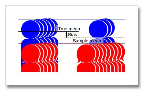
“Suppose you want to know how tall people are on average. But you only have a room containing 20 women and 5 men to measure. Women are shorter than men, so your answer is wrong. You can get a better answer by adjusting for the fact that you don’t have a representative sample – but you have to torture the number a bit.”
When you have a limited data set, the true answer may be masked. But if one knows a little more about their data, like that there are approximately equal numbers of men and women across the planet, or the albedo effect warms the Arctic more than the rest of the planet, the data can be statistically adjusted to match the real situation instead of the situation revealed by the sample that shows four times more women than men in the room, or the sample that disregards Arctic temperature.
So now we have an accurate (relatively of course) representation of the missing temperature data from an area that has always been a trouble spot in the past. What has been revealed is that the so-called “Flattening Myth” has disappeared.
Because warming in the Arctic has accelerated recently means this new technique yields greater changes in recent time frames. It shows up more in the HadCRUT data series because HadCRUT showed the greatest flattening of all the datasets.
HadCRUT’s old trend for 1997 to 2012 was + 0.05 C per decade, now it is + 0.12 C per decade, which is exactly the same as the 2013 IPCC’s + 0.12 C per decade for the long term trend 1951 to 2012.
The same thing is happening with GISS only for a different reason. They have not yet implemented an improvement to sea surface temperature data evaluation that HadCRUT has included. Previously, GISS has shown +0.08 C per decade, now with the improved SST data they show + 0.10 C per decade.
But this is only part of the picture. We still must account for the missing warming that has been going in to the deep oceans. The thermometer record may not reveal the heat that has accumulated, but greenhouse gases are not declining, they are increasing even more rapidly than before. This means that the greenhouse warming trend is now becoming steeper and that there has been more warming recently than has been previously shown by the thermometer record.
The big surprise though is that the 2013 IPCC report tells us that aerosols have masked half of the warming that we should have experienced. These aerosols are the air pollution that the rapidly developing East have emitted. Their smog is cooling the planet so much that it is covering up half of the warming that greenhouse gasses are creating. So in essence, the flattening trend truly is a myth. The trend is exactly opposite and it is skyrocketing. The thermometer record reveals only a part of the global warming heat that is being caused by greenhouse gas emissions.
University of York Press Release: http://www-users.york.ac.uk/~kdc3/papers/coverage2013/background.html
Cowtan and Wray, Coverage bias in the HadCRUT4 temperature series and its impact on recent temperature trends, Quarterly Journal of the Royal Meteorological Society, November 2013.
http://onlinelibrary.wiley.com/doi/10.1002/qj.2297/abstract


